Graphics
We use only authoritative sources. We do not project, surmise or estimate in a graphic. We create work only from what we know. Except as authorized by a manager, we do not use graphics provided by others for which we lack the underlying data. We create charts at visually proper perspectives to give an accurate representation of data. The information must be clear and concise. We do not skew or alter data to fit a visual need. We credit our sources on every interactive and graphic, including graphics for which AP journalists have created the database.
CHARTING RESOLUTION
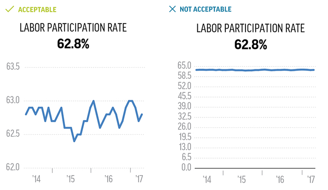
Line charts are great for tracking trends. In this case, the value axis does not have to start at zero. However there are some rules. Your chart should be balanced within the middle of the chart and don't omit time periods. Keep the time intervals even.
Line charts are great for tracking trends. In this case, the value axis does not have to start at zero. However there are some rules. Your chart should be balanced within the middle of the chart and don't omit time periods. Keep the time intervals even.
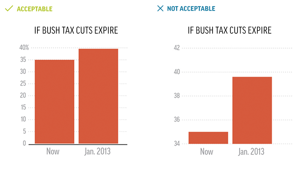
AVOID DISTORTION
Since bar charts compare data points, the value axis must always start at zero. This safeguards bar charts from inaccurate conclusions and exaggerated data.
Since bar charts compare data points, the value axis must always start at zero. This safeguards bar charts from inaccurate conclusions and exaggerated data.